


"Photography is a way of feeling, of touching, of loving. What you have caught on film is captured forever... it remembers little things, long after you have forgotten everything" ~Aaron Siskind
 |
| I personally love this picture. A girl in my critique group thought I should rework the photo so you cant see any metal from the swingset in the upper left corner. She has a point. I need to go to the park again so I could probably try for another shot. |
 |
| I really love this picture. It turned out pretty well. It's a little dark on the bottom, mostly because of time of day. I do like the way the sun looks behind the slide though. I think this is a keeper. |
 |
| I am not sure if I am going to include this. I love the way the light looks, but it actually throws off my series because it doesn't really deal with the architectual stuff like the others. However, the idea behind my series is looking at the youthful energy of a park through the eyes of an adult. People in my critique group that that this could help achieve that because of the adults on the swing. I have a few other photos in mind that could help achieve that same thing, so I am not toooooo worried. |
 |
| Here is a good example of pattern and texture. I like the colors. The sun was setting right behind me so shadows were emphasized and colors were tinted a little yellow. Makes it look warm :) |
 |
| To Be Beautiful |
 |
| At the time, I was focusing on texture and pattern. Though shooting with only sunlight creates nice shadows, this was far too dark. |
 |
| Here I turned the lights on in the kitchen. I added a few drops of water onto the celery to add a little freshness. Though this photo is nice, it doesn't have a lot of character or interest. |
 |
| Hear I added a heart shapped sprinkle. The red and green have a really nice contrast. It is clear that the heart is the subject. Why I don't like this picture, is the heart is actually not 100% in focus. Though it draws your eye, it leaves you wanting a little more. |
 |
| Hear the heart is in focus. Because of the angle of the heart, it's shape isn't definite. Compositionally, this picture isn't perfect on the rule of thirds. |
 |
| Here is the same image. The rule of thirds is when you divide your picture into 9 equal portions. Subject matter will appear more interesting on one of the lines. However, the greatest interest is when the subject is placed at an intersection point. |
 |
| Here, the subject is at the intersection of left and base. Visually, this is interesting. I dislike the separation from the celery in the foreground and the celery in the background. This separation is highlighted because A) I shot in macro mode (blurs background) and B) The celery in the foreground is much lighter. |
 |
| Here is my favorite image. It has several things going for it. The lighting is good, creating a nice texture and pattern. Also, this is a great example of positive and negative space. The green celery is the negative space and the red heart is the positive space. When you have a significant about of negative space, your eye is drawn exactly to the subject. |
 |
| Another reason why your eye is drawn to the subect are the "leading lines". Leading lines are exactly that- lines that lead you to your subject. In this image, the arrow is demonstrating how the natural lines in the stick of celery point to the direction of the subject. |
 |
| Here is a really great example of the rule of thirds I showed earlier. Unlike before, this image has even greater interest because it is placed at a clear intersection point. |


 |
| Okay, obviously this image isn't good at all. No water! |
 |
| This image still isn't good. Though the shutter speed was fast enough to capture a potential drip, this isn't aesthetically pleasing. |
 |
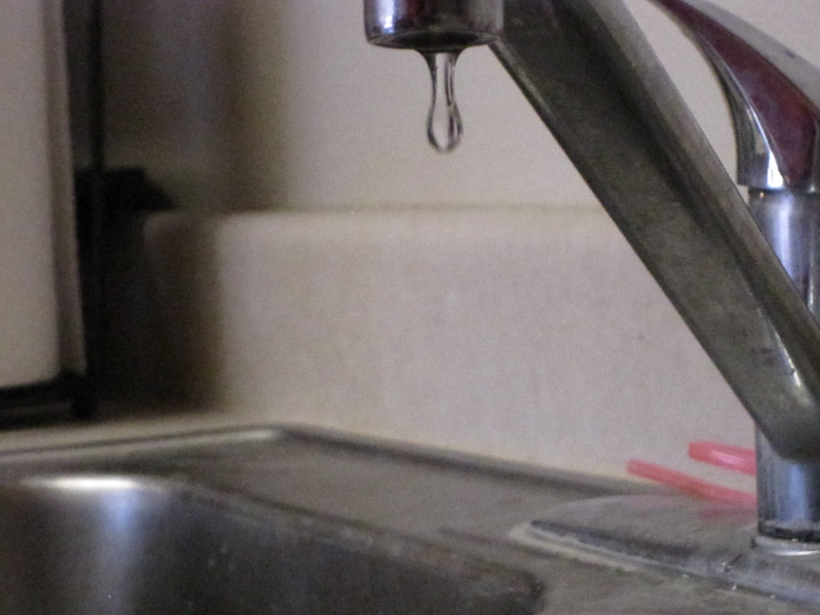
| Now, this one could have been a much better photo with faster shutter speed, and MORE LIGHT. The sink is clearly dripping, but there is no detail. |
 |
| Really nice droplet here, but again, not enough light. The lack of light causes the blur. |
 |
| Okay, this image isn't so bad. The droplets are mostly clear. The problem here is that the droplet is really too small to create any sort of effect. Not too interesting to look at. |
 |
| This droplet is the best out of the "better" section, but again, too blurry. |
 |
| Finally enough light! I love how crisp each droplet is, and how each reflects the light from the lamp. |
 |
| Again, really crisp. Droplets are lower in the photo which makes it feel like it was cut off or something, but the image quality is there. |
 |
| This image is really nice, good amount of light, each droplet is sharp and in focus, and I really love the shadow the droplet casts on the wall behind the sink. I would say this image is the best for three reasons: 1) Droplets are a very nice shape and size. 2) Light creates sharp enough edges 3) Shutter speed was fast enough that there was no blur. |
 |
| Here was my first practice. You can see where it is focused, and where the image is blurred :) This basic example of shallow depth of field will be repeated in all the photos today. |


